PIKAKE
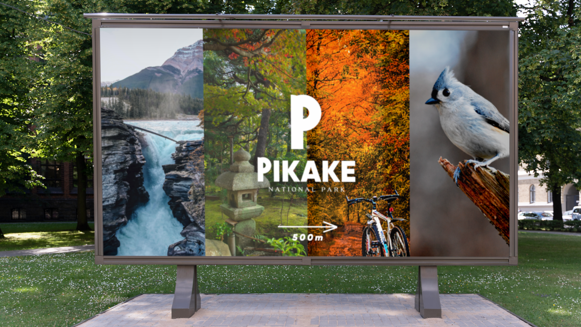
You are a tourist in a distant land and you pass the banner above. Or you’ve seen the poster below around town. Would you be tempted to take a walk?
The brand identity of this national park was an exercise we did where we tried a number of new things. Check out what it’s all about and let me know what you think!

I didn’t want to create just a brand concept, but also an identity system that would highlight the diversity of this national park. For example, let’s say that right before the entrance, you see someone coming out of the park holding the tickets below. Would you be even more curious?
The idea
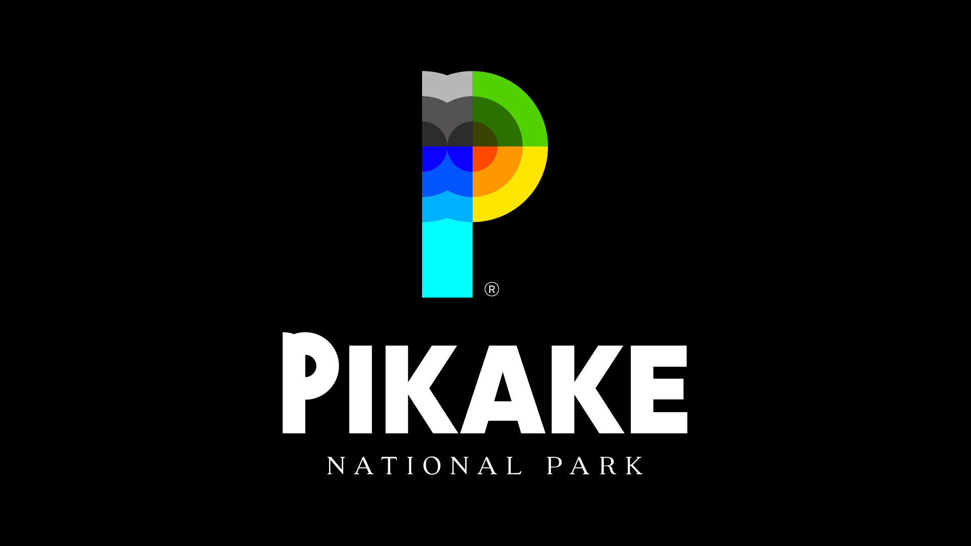
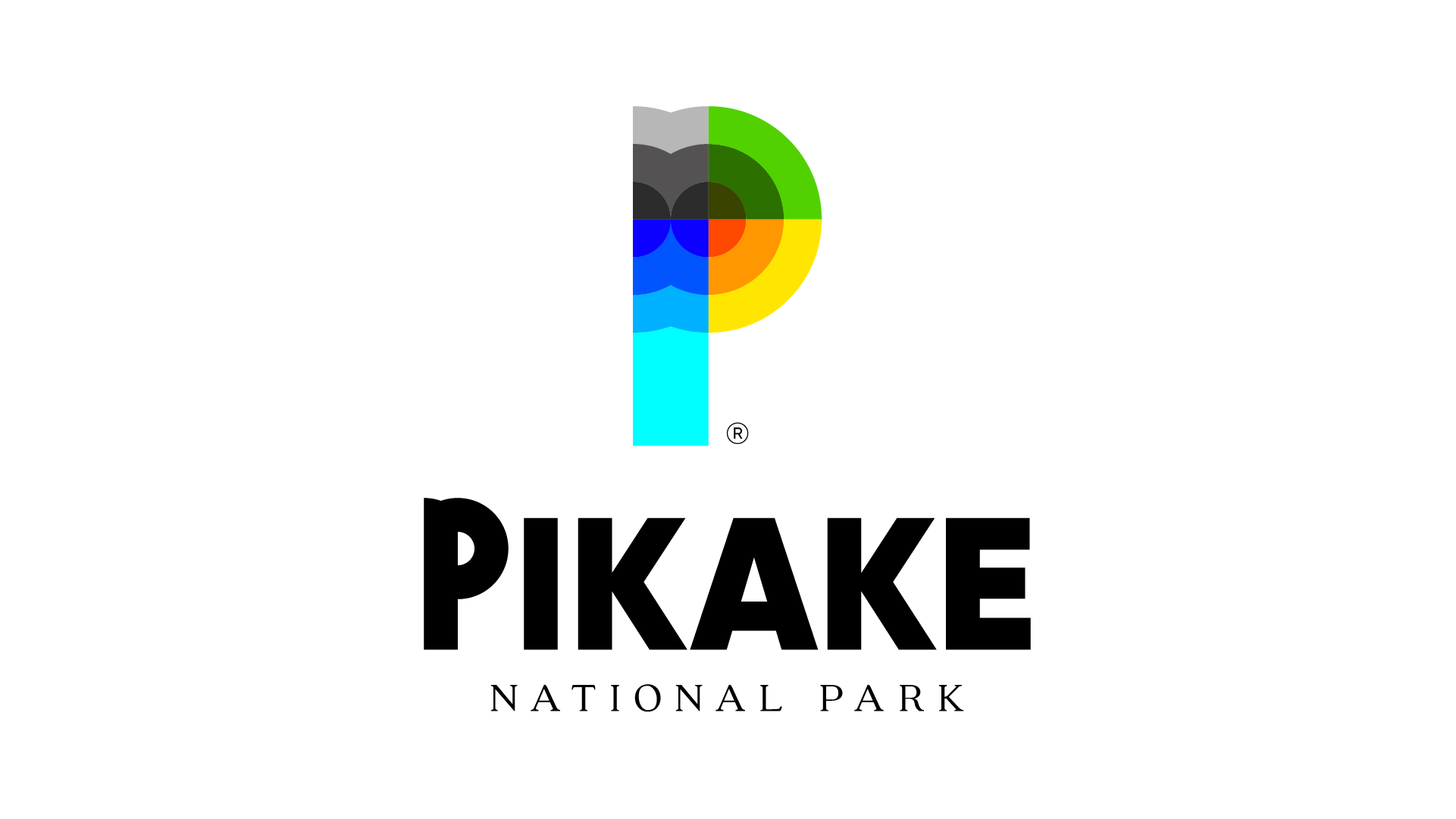
We captured the 4 elements – water, fire, earth, air – and chose a mini-color palette for each, as can be seen from the park entrance tickets. In this way, the design system allows the brand to be used in every context, while illustrating the richness and diversity found in Pikake. In addition, by dividing the letter P with equal circles, we created sections through which the logo became even more meaningful – the gray area subtly captures the bird species, the green area represents how nature comes to life, from the ground and up to leaves/flowers; the yellow zone frames the sun’s rays which decrease in intensity as they descend; the blue area indicates the waves of the waters in the park. They all converge on that central point – the target, the place where you find them all – Pikake.
Logotype
For the logo I wanted to create a contrast between the cheerful side of a space full of nature and the official side of a national park belonging to the state. So I decided to use a serif font for “National Park”, one that conveys seriousness and piques visitors’ curiosity.

Do you also want to build a memorable and valuable brand?
See other projects ↓
Discover the project >>

Discover the project >>