
FUNCTION+
The client presented me with the company’s upcoming innovative product, and it already sounded very promising to me. With a diverse target audience – both B2C and B2B, it was clear that it would be a difficult challenge from which I would have a lot to learn. And so it was!
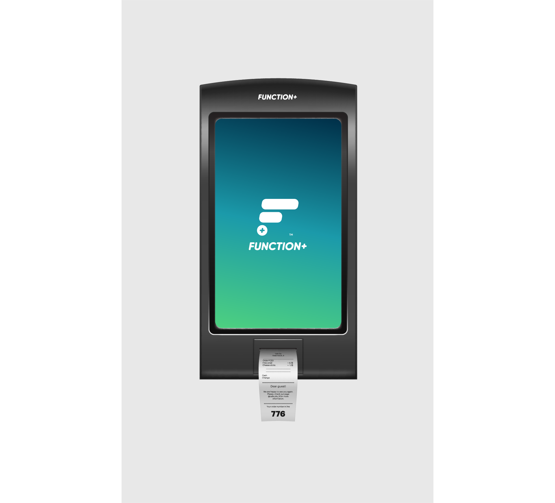
The company that would launch the brand is called InfoMedia. It is a group of innovators from Piatra Neamț that offers various digital solutions. Their new product is a 2025-worthy cash register that integrates multiple solutions into a device the size of a smartphone.
Our approach
A new and innovative product can become a success only if it is based on a coherent brand, built with responsibility. Together with the InfoMedia team, we went through the entire branding process – from strategy to brandbook. But first of all, we needed more conversations about the product – how it works, who will buy it, why it was created.
Visual Identity
Creating a new brand from scratch was the perfect opportunity to create 2 stylescapes – those groups of elements that convey the state and look of the future brand to help the client and the expert make decisions about the new visual identity.
The first stylescape was created more with entrepreneurs and decision-making marketing specialists in small and medium-sized companies in mind. Starting from the promise and attributes of the brand, this stylescape proposes a style inspired by Revolut and some references of smart and simple logos.

The second stylescape contains other brand attributes and another majority target audience – accountants, those whose life function+ will make easier, those who will recommend the product. For this reason, the font and colors differ from the first stylescape, emphasizing the sales process and the smart side of the brand.

Logo proposals
As the references above also illustrate, FUNCTION+ was to function primarily as a digital brand – with multiple uses on various smart devices. That’s why we proposed a series of minimalist logos, most of which are a combination of initial and +. The selection of the “chosen one” was done democratically – the InfoMedia team voted internally and chose from the top 3. The winner is the initial F composed of lines – the statistics that users will find in the application, and a + button to help the brand to be easily identified.

Logo variations
We have created several logo variations that allow the brand to be used in both offline and online contexts. Finally, I integrated the gradient in the background that conveys more of the tech side of the brand.
Visual style
The color palette was selected because it reflects professionalism, is suitable for the business category and, as InfoMedia wanted, gives a friendly personality. The 2 visual patterns we created have different roles. The former is more suitable for use in the digital environment due to the gradient, and the latter brings out the plus button on any cash register.


Brand Communication
We have exemplified several uses of the newly created brand to bring it even closer to reality – application icon, cash register, product box. In the end, we put all the elements that make up the Function+ identity into a toolkit that InfoMedia will be able to use to keep the brand consistent.


Do you also want to build a memorable and valuable brand?
See other projects ↓

Discover the project >>
Discover the project >>

